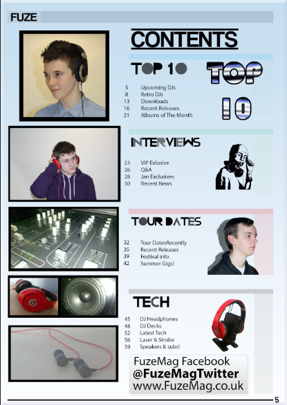
Thursday 21 March 2013

Evaluation Question 7


Evaluation Question 6

1. Flickr


I used Flickr to upload photo's and explain the distribution process for my magazine and how a similar magazine to mine sold and advertised its magazines. I also explained where my magazine was sold to generate most sales. 

How I used it -

On flickr I uploaded Photos of my magazine and wrote about them on the photo description. I discussed the distribution process, after this I needed to add them to blogger, I did this by clicking the share button, then clicked share  and 'Grab the HTML Code' I added this code on the blog so when I viewed the blog it displayed the picture with a link and when it was clicked it went onto Flickr so the description was visible.


2. Photoshop


 I used photoshop to edit all the pages on my magazine, in this ishowU I will explain what i used photoshop to do and edit. I learnt the techniques in my Media lessons, this helped develop my magazine to a professional standard.

Front Cover:

I will explain the multiple techniques I used to create my magazine using photoshop. On my cover to create my Masthead I clicked the Text tool and typed using the font 'Coolvetica'. I changed the size of the font to around '100' so it would take up a large amount of the top of the magazine this made it look professional. To do the Publication Line, I used the same font from the Masthead, but I used a smaller font size and used the colours white and Black for each of the words. To do the Cover Stories I used the same font so it matches throughout, I used my colour scheme: Blue, White and Black for the font so they stood out, but didn't make them that large they distracted from the Artist. I also added a Drop shadow effect to the Text so it looked on top of the box it was sat on. The box's below were made using the shape creator tool, I had this set to make a rectangle shape that I could customize the size on. I also added a drop shadow to these boxes so they looked to be sat on top of the artist image and background, I played with the settings on the drop shadow effect so as the shadow was more pronounced than on the text. On the Main Photo I cut out around the photo and then selected the background and used the gradient tool to add a fade from the edges of the artist to a darker colour, this gave the effect my artist was under a spot light and was appropriate and gave a professional look. I then got the layer with just the artist on and not the background and put this layer above the Masthead layer and this added the effect of the artist being in front of it and much more noticeable as the centre of attention, this was complimented by the spotlight style gradient. For the plus sign in the bottom left I just created 2 small rectangles that were thin at 90 degrees to create the plus sign that is noticed on many currently published magazines as this displays 'exclusive' or 'bonus' content. I did not add a Box around the Artists name, this made it stand out and more unique from the rest of the cover, which was what I was aiming to achieve. For the bottom right corner I sourced a photo off google images of a Barcode and imported it into photoshop, I then placed it on top of a rectangle with a drop shadow, this made it appear above the image again. I then added the price using a text box and rotated it to be in the space below the barcode. Then finally I added a web address to the left of it using a text box and the black font so it wasn't easily noticeable that it was covering the main artist.

Contents:

On my contents page to start at the top I created a banner using the shape creator tool, I coloured it grey and then lowered the opacity so it didn't stand out as much, I then added text with the magazine name in to display what magazine the contents was from. For the Photos on the left I took using an SLR camera (explained below) and then I added rectangular shapes behind to give the effect of a banner of a stroke being added, these were used to display the future contents of the magazine and what to expect. The 'CONTENTS' font at the top was the font 'coolvetica' and I added a line above and below so it was very noticeable and it was clear which page of the magazine you were on. The subtitles of text were modified by me as i rasterized them using the rasterize function along the top toolbar, by doing this I could then change the opacity on certain letters to make these subtitles more noticeable at a glance. I also used a range of neon colours and used opacity on the right hand side, this was a technique I used from a magazine of the same genre used. I also added the text and what was on each page as this portrayed a professional style.


3. SLR

This is the style of camera I used, SLR, I used this camera for all the photos I took for my magazine, I took photos using high key lighting, I did this by connecting the camera to photography lighting equipment, this made my pictures more effective


I manipulated the settings on the camera for using the flash so all the detail was picked up when I took photos. I used many different shot types, as for my cover I used a medium close up shot which I instructed the photographer at what distance to stand and the correct zoom was used for each particular shot. For the Contents page I used a range of different shots, on here I used more close up shots, but to keep the face in proportion instead of going close to their face I zoomed from a distance as this had no effect on their face. I also took more medium close ups as these also showed the clothes the artists were wearing and this was a technique I used to further portray the Genre. On the double page spread I used a single Medium close up, unlike the front cover it was more of a wide shot to show the whole artist.


4. Blogger


Blogger is what I used to show my progression both of my photoshop skill and the progression of my music magazine. I learnt to create posts to display my work and add text around.

I used blogger as a way of showing my progression and imported many different files from my screen shots to prezi's on here. I started at the year new to the program and can now create posts, import photos, videos, and Embed Http Code's. I liked using this program as you can add a title to your posts and display your journey as mine was creating my Music Magazine. You can also add photos and move them to fit around the text you can also add. It is easy to explain what you have done as I am currently doing here. 


5. Prezi


I used prezi to create a slide show style displaying information. I used it to display different types of data and info on my magazine.

With prezi I started off not understanding how to use it, but as i got used to using it I learnt how to create paths in order, for example I used it to display the data of my results of my target audience surveys I conducted, this was a simple way to scan through on how to plan my magazine based on my feedback. For the latest prezi I used a prezi template and learnt how to import photos using the buttons at the top of the screen, I did this and also added text to explain how I had implemented different things into my magazine during the production and across the 3 parts of the magazine I had to make.

Sunday 17 March 2013

Evaluation Question 4

This is the fourth evaluation question. I have included my target audience members expected interests from musical tastes to what would interest them on TV.

This would be my target audience member because this is the tastes of most 15-25 year olds, and the clothing styles worn by those who go to DJ events and also DJs. The music artists are based on what music styles would be included in my magazine. Their music taste is also based on them liking my magazine. These are their expected tastes as these are stereotypically liked by those who also like the DJ genre.

Friday 15 March 2013

Evaluation Question 2


Posture - 

My posture for this photo was similar to the top one as I raised my shoulders and had my arms by my side as casual style look. Having my arms by my side gave a relaxed look the same as the top photo. Unlike the top photo I was stood up straight, where as the top photo was stood at an angle.

Angle -

I was staring into the camera gaining eye contact with the viewer. Both the shots display a confident character as neither are hiding and both are at the forefront of the photo, this means the reader can associate with the artist.

Shot Type -

Both the shots are medium close ups, but the top photo is closer to the artists face and shoulders and could be classed as a close up. The shot was appropriate as the reader can see the clothing and style of the artist, this portrays the artists style and the Genre is then recognisable. This shot also makes the facial expressions visible which is a serious yet relaxed expression.

Lighting -

Both the shots have high key lighting, the lighting on the top photo is a lot lower as there is shade below the chin and the skin colour was darker, but the lower photo is a more vibrant shot displaying my skin as very light. the darker background on the bottom photo makes the artists stand out from the back ground. the lighting was effective on this shot as I had the camera hooked up to flashers that went off when I took a shot with the camera. And because of this the reader concentrates on the artist instead of the background.

Costumes - 

The costumes are similar as both are wearing a blue shirt. these clothes make the artists look both casual and smart at the same time, The bottom photo I am wearing headphones unlike the top image as I wanted the DJ genre to be easily visible at a glance by the reader. Both the images show an artists with uniquely styled hair to show they are different from other artists. I didn't wear any forms of jewellry or piercings as it did not seem appropriate to the genre.

Expression - 

The expressions in both the photos make the artists look serious and concentration is visible on their faces. both are not showing much expression which makes the artist looks serious and emotionless.

Hair - 

The two images both have styled hair in a unique way. This makes the artists both an individual and different to all others. we both have short hair and i had this style as the majority of DJs have short hair. 

To Conclude - 

Overall men are Portrayed as being independent and have an attitude as both have eye contact with the camera. The Males are both also viewed as succesful and indipendance is displayed in their headphones and being on the cover. The both also have their own fashion/style which they decide to wear.


Wednesday 13 March 2013

Research and Planning: What I have done today

Today I have made minor changes to my front cover, double page spread, and also began my first evaluation Question.


Monday 18 February 2013

Research and Planning: Contents Page Change


I have added a colour gradient Fade as the most recent change on the magazine. I used the colours blue and white as these are two of the three colours from my 3 colour rule.

Research and Planning: Model Selection / Deselection

The Models I chose to ask was based on wether they dressed and looked appropriate for the magazine. I used models with short hair as The majority of DJs have short hair. Also long hair is also linked with other genres such as rock and  Heavy metal.

Research and Planning: Software List


I used Photoshop for the production of most of my Magazine and Research and Planning. I used many different skills on this programme. I used drop shadow on the layer style to give a 3D effect. The middle pillar is the tool bar and I learnt to use the majority of these. 

I used In design to start with and learnt to word process using this program.

Research and Planning: New Masthead


I changed my Masthead to lower case as this Is what similar magazines use.

The mix mag title has rounded letters in the masthead, similar to the font I used. Instead of putting a publication line below the text i put it above as there was space. I copied the style as although Mixmag is more RnB it uses a similar style to DJ in the titles and Photos used.

Research and Planning: Blogger Feedback


Feedback I recieved on my blog from other A-level Students.

Research and Planning - Final cover


Wednesday 13 February 2013

Research and Planning: Costume research


These are the clothes and Props used for the shots. The shirt was worn on the cover and the 2 types of headphones were worn on the other shots taken. I also used the headphones for the Tech Section.

Research and Planning: Pose Research


This is the medium close up shot style I wanted to recreate for my magazine cover. I added headphones as a prop to my front cover shot. I used similar poses for the majority of my shots.

Friday 8 February 2013

Research and Planning: Shooting Schedule

This is a Grid showing the times I took photos for each part of my magazine. The photos of people where during the first two shootings and the final was just for my tech section photos.

Friday 1 February 2013

Research and Planning: Magazine Photos + analysis

1

2

3


4

5

6

7

8


9


When all shots were taken i had the photography lighting set up to go off in time with the camera to reduce the amount of shade when necessary.

Shot 1 was the first shot I took using the SLR camera before I adjusted the exposure and settings on the camera to suit the shots I wanted to take. With this model I thought that the second and third shot were of better quality.

Shots 2 and 3 are both using the same pose and shot as they were both close ups and looking away from the camera. The pose was that stereotypically used by a DJ as he was holding one ear cup which is often seen as a thing DJs do. Also he is wearing headphones with the style stereotypically worn by DJs.

Shot 4 was a medium close up or a semi long shot as it included the top half of the legs. This shot wasn't as effective as some others doing the same pose such as shot 9.

Shot 5 was taken looking more casual DJ than other shots as the model was wearing a jacket not ipped up and looking away from the camera.

Shot 6 was the same as shot 4 but with the headphones around the neck to show shots of different styles. the shade on the left of the figure creates a good effect. 

Shot 7 and 8 do not suit the genre so much as they are not dressed to a DJ Style and are not showing the kind of emotions I wanted to portray in the photos.

Shot 9 was used as the front cover photo as it is staring into the camera to look serious, also a medium close up was used as it seemed appropriate for a front cover photo. also I did research from DJmag to distinguish that DJs will often wear shirts buttoned to the top on the cover and also show DJs wearing headphones on the cover.

Research and Planning: Contents Page + analysis


This is my final contents page for the magazine. From the top down analysis:

- The bar across the top of the page links with the bars above the sections of the magazine to give it a professional look and also it was a space to put the Magazine title 'Fuze.'

- The style of the title 'Contents' is in the style of a DJ magazine as it has a line above and below often seen as a feature and to make it stand out.

- To create the different shades on the right on the sub titles I used the eraser on 50% opacity to create different shades of letters this helps the sub titles for the sections stand out.

- The photos on the left display what contents there is in the magazine for example the photos of models is for the interviews section and the photos of the headphones is for the tech section.

- I used small photos on the right to give an insight into what is in each section. also small text is to the right detailing the contents of each section and the page number. 

- I added a bar along the bottom and posted a web address above it for the magazine so people can view content online.